Card
Introduction
Cards are primarily used to convey short information to users.
Mostly seen on E-Commerce websites, cards are used to convery
product illustration, alongwith information and also come with
multiple action buttons.
The cards provided by Powertrain are
350 px
wide, being the most common size widely used across many
platforms.
By default all cards are given a box shadow, to make it
visually more appealing.
Icons are imported and used from
FontAwesome
.
Horizontal Card
Horizontal cards come to play primarily on mobiles or on
websites where you'd like to place the card as discreetly yet
still be visible to the user.
These cards do not have a brief bio/description.
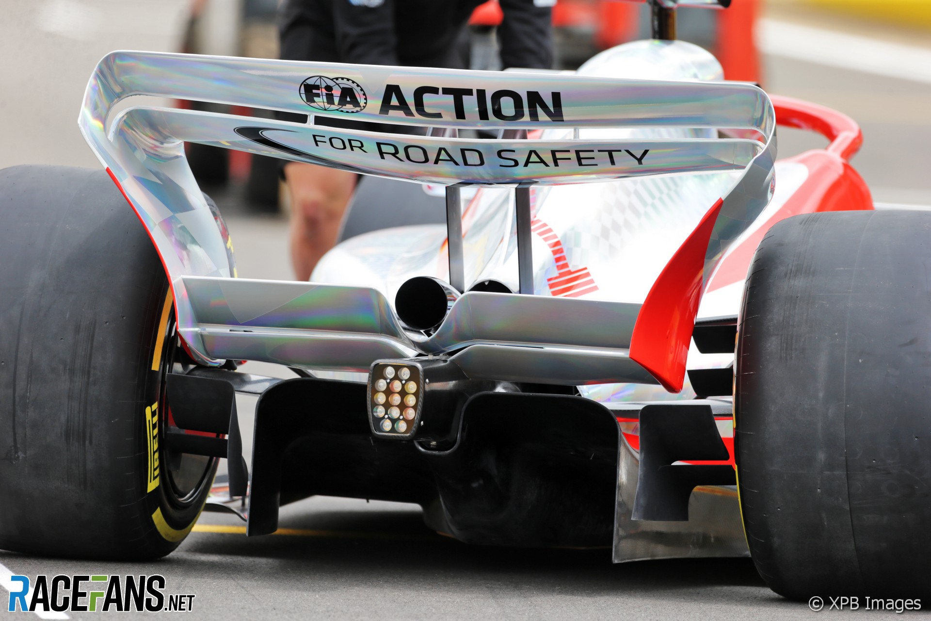
F1 Rear Wing
₹10,000/-
Text-only Card
Text cards simply consist of a title and a description.
Such cards are more widely used for sharing nuggets of
information in a small space.
F1 Rear Wing
Vertical Card
Vertical cards are the most common type of cards seen used
across multiple platforms.
Being vertical means you can fit all the required information
without having to fight for space.

F1 Rear Wing
₹10,000/-
Vertical Card With Badge
Badges in cards are used to convey important information
regarding the content inside the card.

F1 Rear Wing
₹10,000/-
Vertical Card With Dismiss
Dismiss element is provided for the user to be able to either
close or remove the card from window.

F1 Rear Wing
₹10,000/-
Vertical Card With Text Overlay
An overlay is given over the entire card, along with an
overlay text.

F1 Rear Wing
₹10,000/-